
New Font Tools
 News from The Font Fairy — Look for new font tools in Adobe’s forthcoming 2019 releases of Illustrator CC and InDesign CC.
New interface for the Font menu.
Not only will you be able to see a representation of the font itself (not just its name in the menu), but you’ll also be able to test the font on live text in your document. This will save designers a lot of time and hassle.
Best way to see this is by watching a quick demo on Adobe’s website, https://theblog.adobe.com/type-innovations-coming-to-indesign-cc-and-illustrator-cc
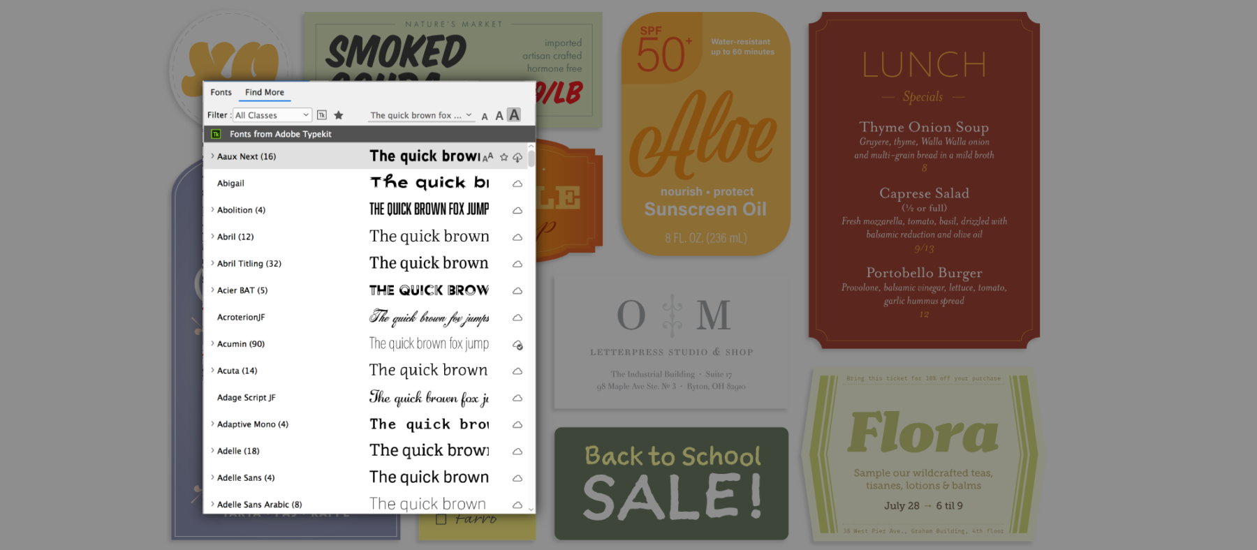
From www.theblog.adobe.com
Pretty amazing!
But for those doing accessible documents, you need to know some of the potential drawbacks of using this type menu feature.
1. Security
Many government and institutional designers can’t use “cloud” features like Adobe’s Typekit because it connects them to an unknown website that can violate the organization’s strict security settings. TypeKit also installs fonts (a form of software) on the computer without the IT department’s authorization.
Think about it: viruses and other malware do the same thing, so IT departments generally prevent these actions. However, this isn't a problem for independent graphic designers.
2. Use of Styles
For accessibility, you must use formatting styles to control which tags will be applied in the exported PDF.
Although in theory you can use manual formatting for visuial design (aka, local overrides), this is strongly discouraged because manual formatting/overrides prevent the content from being adjusted by some assistive technologies. In design parlance, manual formatting/overrides is not “responsive” to the technology. It also glunks up our cross-media publishing + accessibility workflow by putting extraneous code into our content.
But if you’ve been in my InDesign classes, you’ve learned the trick to capture the manual formatting/overrides and convert it to a legitimate style. So you can have the best of both worlds with just a quick extra mouseclick.
3. Font Embedding
All fonts must be embedded into the PDF or EPUB in order to meet accessibility requirements. We recommend that when the PDF is made, that they are subsetted so that only the characters used in the document are embedded and not the entire multi-megabyte font is.
At this time, Adobe’s Typekit fonts can be embedded into PDFs. But there’s a huge change in the font industry itself and many foundaries are charging extra licensing fees to embed their fonts into PDFs. We’ve had insane price quotes for government PDFs uploaded to websites, in the thousands of dollars per font weight. Per year. That’s a lotta dough!
So it’s OK to embed TypeKit fonts now, but I don’t know if Adobe will continue to buck the industry trend or not for the next few years. Time will play this out.
4. Non-TypeKit Fonts
Can’t tell yet if other fonts on your computer system will work with this new font previewer. Sure hope it will!
Lots of font technologies and tags are in development
The past year has seen a lot of development and talk about various font issues. Here are some to keep in mind…but nothing yet that should change how you make accessible documents or conventional ones. These are all in the talking/development stage.
Variable width fonts
Another supercool technology that designers will love.

A responsive lettering example, courtesy of Erik van Blokland. This shows one kind of flexibility that variable fonts will enable. From https://blog.typekit.com/2016/09/14/variable-fonts-a-new-kind-of-font-for-flexible-design/
Jointly developed by Apple, Google, Microsoft, and Adobe, it’s one font file that you can spec for multiple weights, from thin to extra bold.
See these demos (definitely watch the animations):
- Adobe TypeKit Blog: https://blog.typekit.com/2016/09/14/variable-fonts-a-new-kind-of-font-for-flexible-design/
- Monotype: https://www.monotype.com/resources/articles/variable-fonts-making-the-promise-a-reality/
- Adobe Create: https://create.adobe.com/2018/5/22/variable_fonts_are_t.html
Note: This technology is still pretty raw and PubCom does not recommend using variable fonts in accessible documents until a) the bugs are worked out, and b) the accessibility standards are updated and specify how to tag and process them. HTML/CSS is beginning to work on the specifications, but not PDF or EPUBs.
Plus: Only Photoshop and Illustrator can use variable weight fonts at this time. Eventually, InDesign will be included but not yet at this time (August 2018).
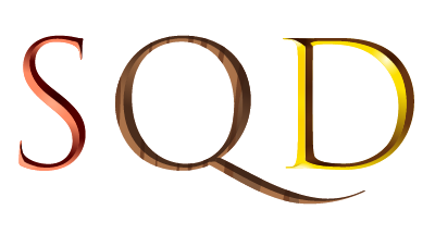
SVG fonts
SVG = Scalable Vector Graphics. An SVG font is an OpenType font where one or more of its glyphs is an SVG graphic. They’re also known as “color fonts” because they’re often used to custom color the font’s glyphs.

Samples are from
Adobe.com
Yes, they’re supercool, too because you can now do awesome things to your font glyphs, such as give them color gradients—even individual characters with different gradients. Or have colorful emoji or symbols.
Best to see the examples here from Adobe: https://helpx.adobe.com/typekit/using/ot-svg-color-fonts.html
Note: This technology is still pretty raw and PubCom does not recommend using SVG fonts in accessible documents until a) the bugs are worked out, and b) the accessibility standards are updated and specify how to tag and process them. One major bug: unpredictable display in PDFs, which means you might not get what you wanted when you save/export to PDF. And that’s just about the visual appearance, not accessibility.
Plus: Only Photoshop and Illustrator can use SVG fonts at this time. Eventually, InDesign will be included but not yet at this time (August 2018).
<b> vs. <strong> tags
<b> was the original tag to bold text in HTML as well as in other word processing and typesetting technologies of the 1970-80s. But in the mid-1990s when accessibility was starting to emerge, the industry switched to <strong> to better describe why the text was bolded; the intention of the visual formatting needed to be conveyed to those using screen readers and other AT.
And of course, this argument applies to the <i> vs. <emphasis> tags as well.
And now the accessibility community has brought it up in various forums.
Don’t worry, no changes to your accessibile tags in PDFs, HTML, EPUBs, and other formats. Stay the course. For now.
 That’s it for now from the Font Fairy. She’ll keep you posted as these technologies develop.
PubCom's training for accessible documents
PubCom has a full array of courses on not just Sec. 508 topics, but also traditional desktop publishing, digital media, and website development.
We started offering accessibility training in 2001, soon after Sec. 508 went into effect and WCAG 1 was released.
Our publishing and design training goes back even earlier to the Pleistocene epoch of digital publishing when Ventura Publisher and Aldus Pagemaker ruled the planet.
Summary: we know publishing, from editorial to design to distribution. And we focus on helping you maximize your technology and streamline your workflow.
Sign up for our upcoming classes or we can bring a custom curriculum to your agency that can train your writers, editors, desktop publishers, and webmasters.
We’re committed to making documents accessible for the nearly 35% of our fellow citizens who have disabilities that make it difficult for them to use computer technologies.
 We teach how to make your documents accessible.
We teach how to fish!
— Bevi Chagnon
CEO and Founder, PubCom
August 2018